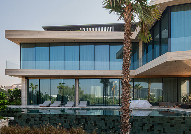
 Sigma’s colour scheme (below) ... safe and friendly towards the partiallly-sighted.
AS PART of Sigma/PPG’s social responsibility ethos, the global paints company has developed colour schemes that provide guidance on the correct colour choices and access provisions that must be considered to meet the needs of partially-sighted people.
This move comes parallel with Sigma Paints’ efforts to stay abreast of ever-changing colour trends and the increasing sophistication of its tinting and colour matching systems.
“An increasingly important issue when creating colour schemes for commercial projects or public buildings in Europe and the US, is the consideration of how easily and safely partially-sighted people can navigate,” says Antoine Lejuez, marketing manager of Sigma Middle East.
“When navigating an unfamiliar area, the vast majority of such people will stop and take visual clues from the space around them. Colour and colour differentiation, when used correctly, can create a potential benefit,” he says.
Apart from its specifically developed colour leaflet in the UK, Sigma/PPG has proposed to follow new guidelines that contribute to the development of suitable colour schemes that ease life for people who cannot distinguish colour nuances.
 |
These include:
• Use contrasting colours: It’s vital that colours not only complement each other but also provide a good level of contrast. Citing examples, Lejeuz says: “Imagine if a bright red and bright blue were photocopied in black and white. The colour differential in the shade of grey between these two bright colours would be nominal.
“Do the same with light and dark blue, and the difference between the shades of grey will be significant. As many partially-sighted people rely on visual clues to navigate, such colour contrasts play a vital role, as using colours of the same tonal value may appear to be the same.”
• Consider light reflectance values (LRVs): To achieve sufficient contrast of colour for critical surfaces such as floors and walls adjacent to one another, understanding LRVs is important.
The LRV of a colour relates to the amount of visible light that is reflected when illuminated by a light source and how much light that particular colour absorbs. On a scale from 0 to 100 per cent – where zero is assumed to be an absolute black and 100 to be a perfectly reflective white – a difference of approximately 30 per cent between colours is recommended. To facilitate easier colour selection, the Sigma/PPG fan deck states the LRV of all colours.
• Identify key features: It is also important that other features of a room are easily identifiable. “For example, there should be enough contrast between the walls and the ceiling so that the person can better appreciate the size and height of the room,” says Lejuez. “The same principle applies to any exposed edges to sloping floors, door furniture, sanitary fittings and grab bars as well as electrical sockets and light switches.”
 |
|
Careful use of contrasting colours ... vital for the safety of partially-sighted people. |
• Ensure good illumination: As both natural and artificial light can affect colour in different ways, another important factor to consider is the way in which a room is illuminated. For example, fluorescent lighting can make certain colours appear harsh or cool whereas daylight can create glare. Ensuring that lighting is bright and even and replacing unsuitable sources of artificial lighting will help create a more accessible environment.
• Choose the right finish: As well as considering colours, the choice of paint finish has an important role to play. Shiny surfaces can cause confusion when visually impaired people are trying to navigate areas, whereas a matt or mid-sheen paint finish will maximise the colour contrast. Designs should also be kept simple and the use of mixed, confusing patterns or stripes avoided.


.jpg)


 (1).jpg)


