 The colour and pattern of the porcelain tile flooring stems from a cement base but features a subtle light swirl.
Dubai-based Brand Creative, a top design and branding firm that has established itself as ‘brand space’ strategist, has adopted a holistic approach when creating an outlet for Scorpion, a home-grown specialty brand in the UAE.
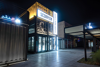
The outlet, which opened its doors in June, is situated in Dubai’s Box Park.
The brand stocks shisha pipes and mouthpieces that can be likened to jewellery in both aesthetics and price point, says Carla Conte, Brand Creative’s creative director and founder.
 |
|
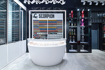
Inspired by the curved body of the scorpion, the cash desk makes a subtle statement and includes a glass-encased display area for premium dokha products. |
For Scorpion, which honours the traditional practice of dokha and shisha, the brief was to create a shop that would bring the edgy, bold brand to life.
Conte says in today’s market, experience is king. “An exceptional retail experience is about creating a space that is memorable, hospitable and enticing enough to convince customers from all over the city to make the drive out and become loyal customers to the ‘experience’ and not necessarily the product,” she elaborates.
Hence, as the project was assigned to designers who are all non-smokers, the team’s biggest challenge was they couldn’t relate to the joy of experiencing the product.
“We quickly set aside our personal feelings on the subject and delved into a strategic mindset that had us focusing on the founder’s past experiences and how we were going to extract that and curate a space that can sell and entertain at the same time,” she explains.
“A love for Al Pacino movies, darts, Turkish coffee and sitting around the majlis after dark with fathers and grandfathers, soon gave us the substance we needed to take the concept forward,” she adds.
The outlet’s industrial exterior complements the masculine essence of the brand, which the firm enhanced with a graffiti-inspired application of the icon. Upon entry to the shop, customers are immersed into a world of monochromatic contrast that dials up drama and masculinity.
 |
|
Scorpion ... honouring the traditional practice of dokha and shisha. |
The custom-designed ceiling feature mimics the sharp pincers of the scorpion and comes to life with subtle movement. Influenced and inspired by its hard, scale-like exoskeleton, bold, detailed textures were utilised throughout, as seen in the routed wood used on the display cabinets and walls as well as the cork cladding used on the darts wall.
The porcelain tile flooring was sourced locally. Its colour and pattern stems from a cement base but features a subtle light swirl which brings another dimension to the space and balances the two largest planar surfaces – floor and ceiling.
All of the joinery carcasses utilised Arreis – a sustainable fibreboard (no added formaldehyde recycled FSC wood-fibre content) and one of few brands available through a local supplier.
The brand carries a host of smoking devices from traditional medwakh pipes through to edgy and ultra-modern shisha pipes adorned with jewels. “As such, we created illuminated and clear glass shelving in order to highlight and display these products as the crafted art pieces that they are,” Conte explains.
Inspired by the curved body of the scorpion, the cash desk makes a subtle statement and includes a glass-encased display area for premium dokha products.
Lighting studies helped achieve an industrial mood with distinctive shadows, whilst strategically highlighting certain products. LED downlights were specified – proven to reduce energy consumption while boasting an extended lamp life.
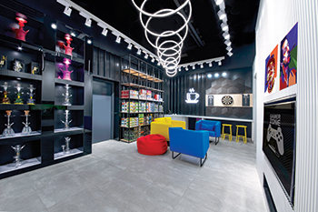
Tying back to the smoke influence, a bespoke lighting feature inspired by smoke rings from an iconic moment in Al Pacino’s ‘Scarface’ was made of LEDs and suspended above the ‘hangout’ area of the store.
The hangout area is a key draw card in attracting and enticing customers to stay, with a complementary coffee bar, dart board, playstation and lounge-like seating. It creates a social hub within the store as well as the opportunity to promote the trial of certain products.
Overall, the design has enabled the brand to make a bold entry into the retail market and transform the perception into one of experience and personal storytelling.
 |
|
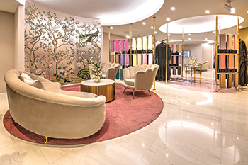
The circular seating area ... featuring hand-painted silk wall-coverings and opulent velvet furnishings. |
Mauzan
In sharp contrast to the masculinity of Scorpion is the womenswear store for Mauzan, which opened its doors in Al Ain last October.
Crafted from the vivid dreams of its founder and designer Rafia Helal bin Drai, Mauzan was conceived in 1990 at the forefront of Emirati designed fashion. The brand celebrates the ‘abaya’ and ‘sheila’ as powerful expressions of a woman’s individuality.
Being an established local fashion house aimed at the modern Arab woman, the objective of the new boutique was to elevate the brand’s current image through a chic new space that women would enjoy visiting time and time again, says Conte.
Along with the new location, the brand also wanted to extend its offering through the addition of signature fragrances as well as on-site tailoring. It was fundamental to the founder that the space has a multisensory quality beyond the visual brought about through the tactile feel of fabric when involving clients in the tailoring process, a curated playlist of soft instrumental music, the smell of her fragrance line and the offering of aromatic hot beverages on arrival – a nod to the inherent hospitable nature of Emiratis.
 |
|
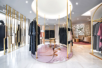
Gold is used on custom undulating curved fixtures from which clothing is displayed. |
“The details in presenting these sensorial experiences were addressed throughout the space,” Conte remarks.
The boutique’s sophisticated interior features the brand’s original feminine pink hues with white marble, tinted mirrors and luxe gold finishes, portraying a glamorous aesthetic that is fundamental to the Mauzan brand.
“Tailored to mirror the characteristic elegance of the traditional Khaleeji dance, where young women dance rhythmically in circles during celebrations, the boutique pays homage to the cherished Emirati values of elegance and modesty. The clothing and the space are unified in the idea of graceful body movement.
“Ultimately, we wanted Mauzan to feel like the expressive dance swirling around each collection. The concept would permeate through the boutique’s planning and fixture design,” says Conte.
Middle Eastern culture and aesthetics are historically as emotive as they are extravagant. Mauzan goes midway between traditional luxury and modern minimalism.
She elaborates: “The boundaries were pushed with thoughtful design details that would evolve the identity into its new direction. Gold is intrinsic to the notion of luxury within the brand and culture, so we opted to cleverly use the metal on custom undulating curved fixtures from which clothing would be displayed. The sinuous gold metal fixtures brought definition to the space and emulated the curved icon within the brand identity in an unexpected way.”
Conte says the multiple entrances to the double-storey unit presented a challenge to decipher a layout that would maximise the flow and encourage footfall in both the fragrance and clothing sections.
 |
|
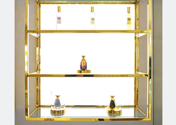
The dedicated fragrance section of the store is separated from the clothing area with an ivory and gold partition. |
“Our team solved the issue by designing circular fixture systems that mimic the body’s natural movement and encourage customers to flow easily into both spaces. The experience is very exploratory, maintaining an element of discovery as customers wind and browse naturally through the space,” she says.
The circular seating area, outside the fitting rooms, complements the intimate ambiance by featuring hand-painted silk wall-coverings from French house DeGournay, and opulent velvet furnishings from Munna.
The fitting rooms feature warm wood flooring, velvet curtains and soft lighting equipped with specialised diffusers that complement olive skin tones in particular.
Brand Creative worked closely with the team at Ansorg to ensure lighting was not only energy efficient but also strategically placed to reduce glare and lend a theatrical contrast to the merchandise.
The dedicated fragrance section of the store is separated from the clothing area with a cylindrical ivory and gold partition, leading the customer into a contemporary, more minimal space to experience the various scents. Chairs are provided so that staff can serve clients in a manner synonymous with a jewellery store.
“With expensive fragrances carefully developed from precious natural oils and ingredients, it was paramount to the founder that clients felt carefully attended to throughout their visit. Beverage bars are cleverly disguised behind cabinetry so that wait times for a fresh cup of Qahwa are no longer than a few minutes,” Conte adds.
A fully clad marble stairwell with back-lid gold handrails winds down to the lower level’s tailoring area. Here, clients have access to various fabric rolls for selection and can watch tailors and seamstresses carefully crafting each piece.
The new concept maintains an understated femininity that resonates with the existing discerning clientele but equally attracts new clients to the experiential space.




(5).jpg)



.jpg)


