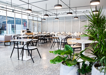
 A striking design feature of the 370-sq-m Chunk Social is the terrazzo flooring.
Simple, refreshing and modest sophistication are key characteristics of two new eateries that opened in Riyadh, Saudi Arabia, last year.
Chunk, a Saudi-based brand renowned for its delightful pastries and desserts, now boasts two new locations, in Riyadh Park Mall and in the Diplomatic Quarter. The larger of the two new locations is called Chunk Social as it is a space in a mall to leisurely dine and socialise throughout the day, while savouring a variety of dishes. Chunk DQ, on the other hand, is dedicated to take-aways and quick service focusing on cakes, crepes and coffees.
Award-winning London- and Dubai-based design firm H2R Design was commissioned to design these two new outlets in Riyadh. Already having established a successful dessert concept with the first Chunk at King Khaled International Airport, the client wanted a refreshed approach to the design of the two new locations while retaining the branding styles and guidelines, according to H2R Design.
 |
|
The space in Chunk Social celebrates transparency from the way the creperie and the open counter are designed. |
“The goal was to refine the concept and H2R Design was called in to translate the client’s vision into tangible models,” says Hasan Roomi, Co-Founder of the firm.
After studying the brief, viewing the locations, and understanding the vision, H2R Design decided to focus on preserving the identity of Chunk but to also uplift its personality with a design that was more in-tune with the concept. With a view to keeping it raw, transparent and honest, a minimal interior design was developed keeping the space clean, fresh and neutral. This allowed contrasts to be revealed against the canvas and to let the menu do the talking, he explains.
Hasan’s brother Husain, who jointly founded the design practice, elaborates on the design: “The inspiration of this project resulted in a design that is simple and refreshing. The secret to creating something that visually appears to have a modest sophistication and seems quite simple, is actually in the detail, which makes the space flow seamlessly. Whether it is the way the edges of the frames are slightly rounded, or the transitions and trims in the terrazzo flooring are spaced, and how they are aligned with the frames of the perimeter glazing, it’s the detail that unites the space into one.”
“The delicate routing of the marble slabs or the carefully aligned shadow gaps to each joinery piece, demonstrate the intricacy and the attention to detail reflecting the concept’s ideology. It is further translated through the dining offering and the overall experience of the space,” he adds.
The colour palette of this project can be defined as refreshing and neutral with concrete, stainless steels and black metal as the predominant chromaticity across the locations.
 |
|
Black framing on the walls, in the furniture and in the lighting grid add an elegant contrast to the neutral materials at Chunk Social. |
A striking design feature in 370-sq-m Chunk Social is the terrazzo flooring, which was placed as a statement facet since the rest of the design is so pure and minimal, says Hasan. However, with the canvas space at Chunk DQ being much smaller at 140 sq m (inclusive of terrace), sheer micro-topping was used to cover the floor versus the terrazzo which would have made the space claustrophobic.
Above the flooring, clean and neutral micro-topping fascia appear with timber detailing in the banquettes to add warmth, along with rattan and designer furniture pieces. Black framing on the walls, in the furniture and in the lighting grid add an elegant contrast to the neutral materials.
The crisp white ceiling and light grey textured walls reinforce the minimal fresh vibe.
“Elements such as the hanging shelving in Chunk Social subtly divides the restaurant’s dining space and the counters, while maintaining a harmonious connection from one section to the next.
“Stainless steel is another prominent element. It has been placed in its untainted form, with no powder coating or electroplating. It is kept in its purest form for an authentic look.
“Concrete micro-topping on the counters and the joinery items has created a powdery neutral mood. In contrast, black metal was implemented into the design to juxtapose the neutral toned materials,” says Hasan.
The space in Chunk Social celebrates transparency from the way the creperie and the open counter are designed. Minimal and accessible, with visible shelving, the open counter and creperie tease diners with glazing for the mouth-watering desserts and speciality coffees.
The contrasting features of the design are expressed by the white tiles against the dark walls or the micro-topping facets with stainless steel countertops and framework of shelving.
 |
|
Chunk DQ covers 140 sq m, inclusive of a terrace. |
In Chunk Social, marble table tops umbrellaed by marble walls, subtly convey the refinement, the unassuming luxury and savvy sophistication of the space. Additionally, there is a marbled column where H2R Design has created a cantilevered-style ledge.
Fine mesh was added to create some depth and layer to the raw materials. It was also artfully used as a partition between the central banquette, the shelving display behind it, and to the perimeter wall and windows, to add depth and texture.
Elements of greenery that pop against the canvas almost feeling like a fresh calm oasis was adopted to create a sense of zen, Hasan remarks.
For the lighting, a simple grid was drawn, illuminating the space with large round fixtures over the dining area and track lights at the edges. All of the lighting features are in black, creating a contrast against the minimal clean white ceiling. The feature lights also highlight the dining spaces, and the spots accentuate the perimeter, shelving, and façades.
In addition to adding the unique design features developed by H2R Design, ideas from the original venue were migrated to the two new locations but with a revamped approach. For example, concept of light boxes that exist in the original venue was taken to the Chunk DQ, but H2R Design refined the shape, size and design. The updated version has slimmer frames, less reclaimed wood, more pure neutral materials, such as concrete micro-toppings and stainless steel.
 |
|
Chunk DQ ... the spotlights accentuate the perimeter, shelving, and façades. |
However, in Chunk Social, H2R Design had the spacing capacity to use handwritten language instead of lightboxes, further distinguishing this rendition of the concept from the others.
While the majority of raw materials were made in Saudi Arabia, the furniture is sourced from the Italian brand Pedrali, along with an original rattan chair from Thonet and bar stools from the Danish designers, Muuto. Skylume provided the lighting fixtures.
The interior design contractor for Chunk Social was D-Code (decoration code), while Nirvana Interiors carried out the work on Chunk DQ.
Work on Chunk Social was completed in February 2020, while Chunk DQ was ready a month earlier.
H2R Design’s founders Hasan and Husain, a pair of young dynamic UK born brothers with Middle Eastern background, have been designing some of the most renowned commercial and hospitality spaces across continents. Supported by a team with broad global experience, H2R Design maintains a diverse commercial portfolio with primary focuses in the hospitality, food and beverage (F&B) and retail sectors.



.jpg)


.jpg)







.jpg)
