 The baffles in the ceiling represent the coming together of the companies.
When the global food and beverage (F&B) leader PepsiCo wanted to create an agile, accessible and Covid-safe workspace at its Middle East headquarters in Dubai, it turned to UAE-based architectural and design consultancy service SAY Studio to provide an environment that was comfortable and welcoming for its staff.
The design consultancy says it was tasked with creating a better working environment for PepsiCo’s employees at its 2,400-sq-m office in Emaar Square, which would offer them a more dynamic, flexible and long-term solution in light of the new normal.
An important part of the process was change management, which entailed getting employees onboard with the move from the traditional closed individual office layout to an open collaborative space, it adds.
 |
|
PepsiCo’s office is designed to provide a long-term solution in light of the new normal. |
Matthew Sexton, Managing Director at SAY Studio, comments: “In commercial design, a number of clients have flagged workplace issues arising as companies adjust to life in the ‘new normal’. What this means for us as the deliverers of this ‘new normal’, is our work is intrinsically linked to change management, and the holistic process of implementing resilience within a workforce. As an employee, you are typically removed from a business decision to upgrade or move offices; so, many blue-chip companies are now getting their workforce on board using change management techniques.”
“Change is rarely readily accepted, and so part of our brief from PepsiCo was to ensure its workforce was as excited about the new office space as management were. Enabling employees to hit the ground running when it came time to return to the office was paramount,” he explains.
SAY Studio designed a variety of new work settings for the client, while showcasing all the different brands under the group’s umbrella.
“Inspired by the brand’s amazing history, the design showcases the most important elements of the company’s timeline, namely the coming together of Pepsi with Lays in 1965, that led to the launch of PepsiCo,” Nervan Helmy, Interior Designer at SAY Studio, tells Gulf Construction.
 |
|
The back-of-house space showcases PepsiCo’s brands throughout. |
The reception area was inspired by PepsiCo’s rich history with the two founders, Donald Kendall and Herman Lay, merging companies. This area represents the two brands: Pepsi-Cola on the one side with a Victorian-era design, and Frito-Lay on the other, with a more modernist design, she says.
“The baffles in the ceiling represent the coming together of the companies as the ceiling design from one side merges with the other. The brief requested us to keep the design simple, clean and fresh, so we used more neutral colours and designs for the front-of-house area,” she explains.
The back-of-house space showcases PepsiCo’s brands throughout. Every room in the employee area was inspired by one of PepsiCo’s products. One meeting room, for example, has an orange-and-black colour scheme to represent Cheetos.
 |
|
The library and lab have custom-made light fixtures created using old 7Up bottles. |
Helmy continues: “PepsiCo places high emphasis on farmers’ welfare and has numerous projects set up to support them. To highlight this brand pillar, we designed four meeting rooms under this theme. Each room is themed using: seeds, water, organic farming or farmers. The rooms are all accessed via an open area inspired by nature. In order to achieve this, we used an organic green as the main colour, and biomimicry through natural materials and forms, creating a sense of being at one with nature, standing under a tree canopy represented by the feature acoustic baffles.”
Other notable design features include the F&B-inspired café, games and training room that open up to form a townhall, as well as the library and lab working spaces that give employees more environments to focus and collaborate in.
“These multipurpose rooms were designed to feel like a café; we used brick panels and island counters. We put beverage fridges and products on display, not only in these rooms but throughout the office. The beverage fridges are sleekly integrated within storage cabinets to create a more seamless design aesthetic.
“We worked with PepsiCo’s internal branding team to design the acoustic panels in the multipurpose rooms, which showcase historical and vintage imagery of PepsiCo. The library and lab each has custom-made, feature light fixtures created using old 7Up bottles, provided by the local bottling facility in Dubai,” Helmy adds.
 |
|
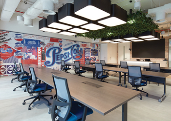
The games room ... vintage posters and colour pops balance the neutral floors and ceilings. |
The design included many elements that ensured the wellness of employees. To ensure a Covid-safe work environment, the meeting room, training room and games room are interconnected and can easily be transformed to meet different Covid-specific needs, such as creating a large function room that allows for social distancing or creating a smaller storage room off to the side for PPE (personal protective equipment), Helmy points out.
The design features numerous physical segregations for people to sit in individual pockets of space rather than one open-plan area, if necessary. Individual lockers are available to employees to store their belongings while out of the office. In addition, workstations include privacy screens which act as social distancing barriers.
Materials selected had antimicrobial coatings and are easy to clean.
“One addition that came after the initial design was installing sanitisers across various locations throughout the office. The charging stations, a shared resource in the office, also has a built-in sanitation device to ensure the safety of employees,” she adds.
Commenting on the different materials and finishes and colour palette selected for the interiors, Helmy says the materials were selected for their functional and sustainable aspects. Concrete floors are featured in circulation areas, while workstations and meeting rooms are fitted with carpets.
“The seed-themed room has scented panelling using actual seeds, creating a multisensory experience for visitors. The organic farming room uses natural materials like cork, while the farmer-themed room has a rougher design to create a hand-made look,” she explains. “Materials were selected from around the world, but as the pandemic progressed, we had to become more agile in our response to the situation. Certain upholstery fabrics had to be respecified as manufacturers went into lockdown,” she points out.
 |
|
The feature acoustic baffles give a sense of being under a tree canopy. |
The front-of-house area within the reception and client meeting rooms is kept basic with greys, whites and black tones. Additional colour is brought into these rooms as accents within the furniture. The staff area is inspired by the bold colours of PepsiCo products to create a playful industrial space. Walls feature images, vintage posters and colour pops, balanced with neutral floors and ceilings.
Commenting on the challenges of the project, she says: “From a design perspective, we had to be very conscious of staying on brand while choosing colours that wouldn’t promote competitors. The brief also requested integrating different technologies into the design, including smart glass, projection screens and large LED panels. We, therefore, had to ensure we had the physical space to accommodate these elements; having exact dimensions was a must so that they were seamlessly integrated.
“Another request included being as sustainable as possible, which sits very naturally with us as a brand, as well as saving on budget during these difficult times. SAY Studio reused as much of the existing furniture as was possible, while some was reupholstered. This was a challenge because it required detailed surveying and then integration into our new design aesthetic, so that it didn’t look out of place. Our new design was fresh and clean, so we had to make sure the used items fit well.
“Implementing the design had to be done in different phases as the office was still in use. The office went from three floors to one, with many people being moved around during this period. This required thorough planning, communication with the client and adhering to deadlines to ensure employees weren’t unnecessarily disrupted.
“As fit-out continued, the UAE went into lockdown, leaving us unable to supervise the work. Most of the site supervision had to be done remotely through the use of technology. We used Matterport scans to supervise work and show progress to the client.
“After the interior work was finished, we assisted with getting employees on board with the new office. SAY Studio used real-time rendering software to create a real-life, 360-degree, virtual tour of PepsiCo’s new office for staff to experience in advance of coming back to work. The tour included intricate details such as bottles in fridges and digital screens displaying live campaigns. The virtual tour was rolled out during a company-wide meeting, allowing each employee to virtually visit the new office space before their first day back,” she explains.
Micheline Dantziguian, HR Associate Manager and Business Center Lead at PepsiCo, says: “Implementing new ways of working means change, and change is not always easy. Coming back to work after the year we’ve all had is undoubtedly stressful. We wanted to ensure that our employees not only felt comfortable and welcome in this new environment, but also excited to experience it first-hand. Our employees are our currency and it is important we invest in them first. We’re glad to have come together as a family at this difficult time to enjoy this moment together, with minimal disruption. We’re incredibly excited and believe our employees will join back with renewed enthusiasm.”




.jpg)

.jpg)





.jpg)
