


_0001.jpg)

.jpg)


.jpg)


.jpg)


 Plain at City Centre Mirdif ... a monochromatic neutral space, with hints of soft colours and touches of warmth from timber furniture and panelling on some joinery items.
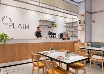
Plain’s outlet at the City Centre Mirdif in Dubai, which opened late last year, has been designed to ensure that the products of this UAE handcrafted dessert concept stand out within a tranquil ambience, says H2R Design which was responsible for its design and fit-out.
The aim was to create a clean yet attractive aesthetic that would complement Plain’s wide range of flavours and high-quality desserts, according to the award-winning London and Dubai based design firm, which was asked to develop the brand identity and interiors harmoniously.
The design studio translated the brief holistically, creating a neutral expression allowing all the creative and wonderful dessert offerings to appear as anything but plain.
The inspiration and mood of the concept can be defined as a monochromatic neutral space, with hints of soft colours and touches of warmth from timber furniture and panelling on some joinery items. The overall theme is tonal and understated yet fresh.
 |
|
The blue from the branding covers the banquette seating. |
“H2R Design studied the depths of Plain to design a space that truly reflected its identity. The research uncovered the concept’s origins, stemming as a place to serve Japanese desserts. This automatically led to the design embracing a more minimal and tranquil approach,” says Hasan Roomi, which founded the studio with his brother Husain.
“However, the concept needed an identity for itself. Researching the menu offerings, H2R Design incorporated tones that were inspired by the desserts. For example, the toppings on top of the kakigori (a shaved ice dessert), added a splash of colour to the otherwise plain coloured sweet and the honey toast and pancakes having beige and off-white tones.
“This led to a neutral on the outside, a surprise on the inside approach for Plain’s whole design conceptualisation,” he adds.
There is alignment from the entrance all the way to the counter at the back, framing the 118-sq-m space. Tying in the branding with the interior was crucial and this is how H2R Design created the concept from paper to build, says Husain.
“Overall, straight simple lines are displayed throughout the space, where everything is there to be functional, while still maintaining a minimal beauty. Due to how minimal the space is, H2R Design had to pay attention to details, with how frameworks met, the datum lines of the mesh, and perfecting every single joint,” he says.
H2R Design used neutral toned micro-topping in abundance in addition to stones in similar in colours. Stainless steel is the dominant ingredient in the majority of the metals, which sit fresh against the warmth of oak timber design features.
Plain’s unique products, branding, and fresh neutral interiors identify the colourways, which are of neutral blues and beiges in the branding and the accent in the pink and tan in the furniture. H2R Design integrated the warm pink and tan colour tones into the fabrics of the loose furniture. The blue from the branding covers the banquette seating, so diners can feel the connection to the interiors.
The use of grey micro-toppings, stones, floor tiles and greys in the structure allowed for H2R Design to create a very lightly coloured space for the display of the food.
Oak timber has also been used throughout the space to ignite some warmth amongst the monochrome mood.
Mesh is a distinguishable feature throughout in the design. It is used to frame the space and to create a canvas to stencil the branding icons that represent the food offerings. The mesh also frames the key spaces such as the back counter. Stencils are done with paint directly onto the perforated mesh, bringing together the branding icons with the interiors.
The decorative light fittings are modest and neutral in colour but also had to be tuned with the luxe levels from the mall’s interiors. The ceiling lighting is flush clean, minimal, and practical, while decorative grey neutral Muuto light fittings hang above the perimeter tables.
Originally, the flooring design also featured micro-topping; however, for durability tiles were used instead.
Minimal greenery with a wonderful story can be found on the shelving and tables. These décor pieces were purchased by a client from a charity supporting children with special needs.
The interior décor contractor was Spex and Fusion Interior Design, while lighting solutions were provided by Skyelume with decorative fittings products sourced from Muuto.